A daring cabinet color can bring personality, style and charm to a kitchen. For inspiration on venturing beyond safe neutrals, see how designers used mauve, green, sapphire, teal and bright blue to create inviting, one-of-a-kind kitchens.
Designer: Rochelle Grass of Dwelling Place Interiors
Location: Greenville, South Carolina
Size: 392 square feet (36 square meters); 14 by 28 feet
Homeowners’ request. “After living in their idyllic neighborhood for 20 years, this couple chose to renovate their dated home’s entire first floor rather than leave their dear friends,” designer Rochelle Grass says. “They host up to 75 people at a time and are the hub of their neighborhood. We drafted an entirely new floor plan, moved the kitchen to the opposite side of the home, created open flow throughout the common areas, added a bathroom, furnished the home and much more. It’s now a place where they love to relax and enjoy good company.”
Cabinet color. “My client loves green, so I knew that Sherwin-Williams Oakmoss was a winner for some of the cabinetry,” Grass says. “I balanced this vivid color with neutral stone and warm woods in the other cabinets and floors.”
Other special features. “We built the room around a custom range alcove that centers the kitchen,” Grass says. “This is a beautiful architectural feature as well as a practical space that keeps all of your spices and oils handy when cooking.”
Designer tip. “Always have three words to describe how you want your space to feel,” Grass says. “These clients wanted classic, comfortable and spacious.”
Grass started using Houzz Pro after this project was completed. “I wish I had known about Houzz Pro for this project,” she says. “Having the 3D floor planner would have been ideal to share the new floor plan with these clients. We removed a second staircase to create a home office, turned a sunroom into living space and reoriented all the rooms. The scanner would have saved hours of work.”Find a kitchen designer on Houzz
Designer: Jasmin Lee of The Design Intention
Architect: Jason LaGorga of DesignCrossover
Location: Brookline, Massachusetts
Size: 193 square feet (18 square meters); 10 feet, 6 inches by 18 feet, 4 inches
Homeowners’ request. “The existing kitchen was a classic white Shaker style — clean but no longer aligned with the homeowners’ personal taste or lifestyle,” designer Jasmin Lee says. “They wanted something more modern, with a fresh look that felt warm and inviting while still being highly functional. By reimagining the layout and incorporating smart storage solutions, we maximized functionality. Warm colors and natural materials replaced the stark white, bringing depth and personality to the kitchen.”
Cabinet color. Jewel-tone blue (Hidden Sapphire by Benjamin Moore), paired with rich walnut. “The painted cabinets bring a bold, modern personality to the space, while the walnut adds warmth and grounding natural texture,” Lee says. “The upper walnut cabinets feature ribbed glass fronts, which add interest, allow glimpses of dishware and keep the look lighter than all-solid doors. The cabinetry is accented with brushed brass hardware, which ties everything together with a touch of luxury and warmth, balancing both the bold color and the dark wood.”
Other special features. Soft gray stone countertops and backsplash. “The tone is cool and elegant, providing a calm surface that balances the richness of the cabinetry,” Lee says. “The stone’s subtle pattern adds depth without competing with the bolder cabinet colors.”
Designer tip. “My favorite design technique is to begin with zones — defining how each part of the kitchen will be used — and then creating specific storage and functionality within those areas,” Lee says. “For example, if a client loves to bake, we determine the best place for the mixer and all the coordinating ingredients so everything is within reach. By starting with zones, we uncover where storage is truly needed, how the kitchen will function day to day and how to eliminate the frustrations of the old layout.”
9 Ways to Save on Your Kitchen RemodelDesigner: Kelly Vickers of Zimmer Design
Location: Minneapolis
Size: 98 square feet (9.1 square meters)
Homeowners’ request. “The kitchen was too closed off and small,” designer Kelly Vickers says. “There was no storage. Cabinetry didn’t match and had been pieced together over the years. They originally wanted to add on to the back of their home. We presented two designs, one staying in the footprint and one with an addition. The homeowner chose to stay in the footprint based on the design that was provided, as it allowed for an open kitchen with more storage and better flow without needing more space or costs.”
Cabinet color. Aegean Teal by Benjamin Moore. “This vibrant teal was selected to match the homeowner’s upbeat personality and love of color,” Vickers says. “We wanted a unique look specific to her bungalow-style home. Brass hardware and lighting fixtures pop on these colorful cabinets.”
Vickers says she uses Houzz Pro software for all her projects. “I use it as a platform for sourcing, proposals, project management, sourcing tracking and scheduling.”
Other special features. Ultracompact stone-look countertops (Awake by Dekton). “The undulating cream subway tile backsplash brings an organic texture to the space, uniting the countertops with the upper cabinets,” Vickers says. “Stacking it in a vertical offset creates a contemporary look while still feeling traditional to the home. Blending in the original buffet built in at the peninsula creates warmth and allows both spaces a sense of belonging. We also added oak flooring.”
New to home remodeling? Learn the basics
Designer: Adair Witmer of Ambiance by Adair
Location: Lancaster, Pennsylvania
Size: 160 square feet (15 square meters); 10 feet, 6 inches by 15 feet, 3 inches
Homeowner’s request. “The client, a bachelor, loves to cook but had a very old and inefficient kitchen that was made up of too few cabinets, a huge radiator taking up a corner, an old range, a sink cabinet that covered part of a window and many obstacles,” designer Adair Witmer says. “He wanted to update the room to have a Mediterranean feel with ample storage and display spaces for his cooking collectibles.”
Cabinet color. “I chose to have two contrasting colors of cabinetry because I wanted the cabinets to go to the ceiling and to have all one color would look monotonous,” Witmer says. “I found a simple Shaker-style cabinet with thin rails and stiles in a beautiful blue for the base cabinets and wood for the tall cabinets. To break up the run of cabinets, I designed some to stack 36 inches with a 12-inch square glass cabinet above. I added floating shelves to provide interest to the space and give the client lots of places to display his collectibles.”
Other special features. “Granite counters and backsplash were used to bridge the blue and wood and provide a showstopper the moment you walk into the kitchen,” Witmer says. “Simple LVT (luxury vinyl tile) was used on the floor that complemented the space without drawing attention.”
Designer tip. “I believe in breaking up runs of cabinets with floating shelves and glass cabinets and making a statement with the backsplash,” Witmer says. “I always have lights on dimmers and insist on under- and in-cabinet lighting to create the ultimate in ambiance.”
More on Houzz
Read more stories
Browse photos for ideas
Find a home professional
Related Posts
Unlock Success in Business and Life — decor8
Hi dear readers, I have an inspiring self-study course that’s…
8 Color Trends From the Maison & Objet Design Show (15 photos)
The home decoration world reunited at Maison & Objet’s September…
4 Beautiful Kitchens in Blue, White and Wood
After: The kitchen retains its original footprint, but custom inset…
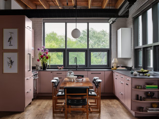
Designer: Sarah Montgomery Interiors
Location: Chicago
Size: 169 square feet (16 square meters); 13 by 13 feet
Homeowners’ request. “The homeowner loved to bake, host and gather friends and the kitchen was one of the most important spaces in their home to them,” designer Sarah Montgomery says. “The original kitchen was the same layout but the cabinets were in bad shape. Our client’s goal was a kitchen that got them excited to be in each day, something unexpected and that spoke to their artistic eye. The client didn’t want a typical island. Instead they wanted a moveable extension table at the center, great for pulling out during dinner parties or using as a workstation.”
Cabinet color. Pale purple (Muskoka Dusk by Benjamin Moore). “Since the kitchen is part of an open concept, the design needed to be just as strong as the functionality,” Montgomery says. “As a color lover, our client loved the idea of colored cabinets and we landed on this shade of mauve. The industrial bones of the space are softened by the color, providing just the right amount of contrast. One final detail was the curved open shelving on the edge of the cabinets, softening the edge and transitioning into the living space.”
Other special features. Black ultracompact countertops (Dekton). Oil-rubbed bronze hardware. Vintage dining chairs.
Designer tip. “Completely paneling the fridge and dishwasher in the small, open space made it feel less utilitarian by softening the look of appliances,” Montgomery says.
Montgomery uses Houzz Pro software. “We use Houzz Pro for project management,” she says. “We use the Selections boards to upload our items and send them to our client for an easy approval process and so they have access to all the necessary details. We use Houzz Pro also for sending proposals. We share the client dashboard so they have easy reference for their boards and documents at all times. Lastly, we log our time through Houzz so that our client gets clear invoices breaking down the time spent month over month.”
See why you should hire a professional who uses Houzz Pro software